Wesbridge Capital
Close Copy
Problem
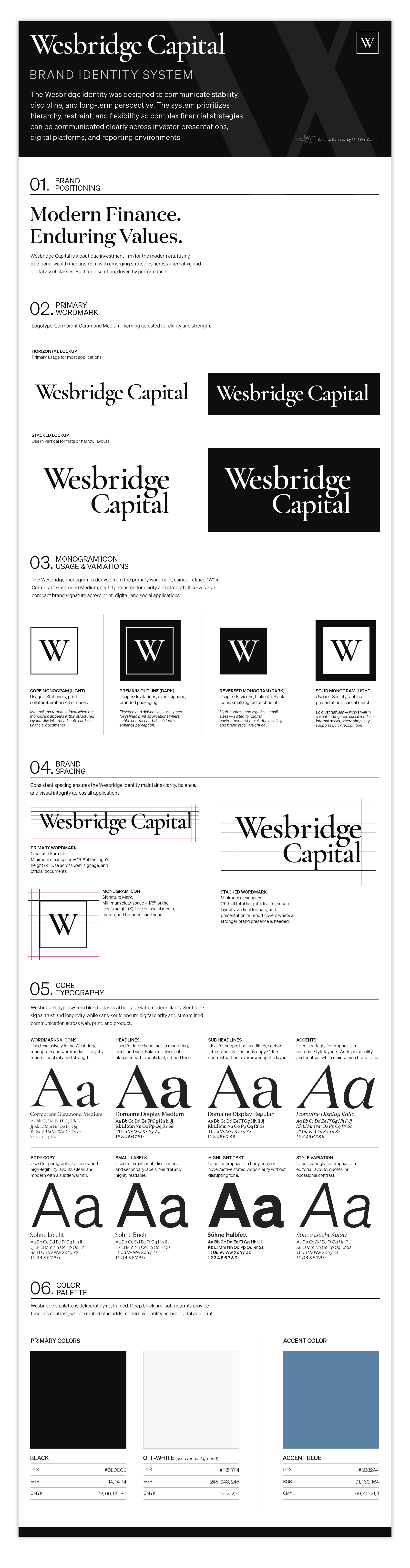
Private capital firms operate in an environment where trust, discipline, and credibility are essential. Wesbridge Capital required a brand built entirely from scratch that could speak to sophisticated investors while avoiding the visual clichés common in fintech and investment marketing. The challenge was to create an identity that conveyed authority, stability, and long-term thinking while still feeling contemporary and deliberately designed. The brand also needed to translate effectively across investor communications, digital platforms, and presentation materials from the outset.
Strategy
As hands-on Creative Director, I developed a complete identity system centered on clarity, restraint, and quiet confidence. The logotype was custom refined from Cormorant Garamond to balance a sense of heritage with modern precision. A disciplined black-and-white palette, paired with a distinctive accent blue, established a timeless visual foundation. I also created a comprehensive brand framework covering typography, color, spacing, tone, and usage, ensuring the identity could extend seamlessly across presentations, digital experiences, and future communications.
Results
The final identity positions Wesbridge as a firm defined by clarity, discipline, and long-term perspective. The system provides a cohesive foundation for investor presentations, marketing materials, and the forthcoming website while allowing the brand to scale consistently as the firm grows. The result is a refined, institutional presence designed to inspire confidence from the very first interaction.
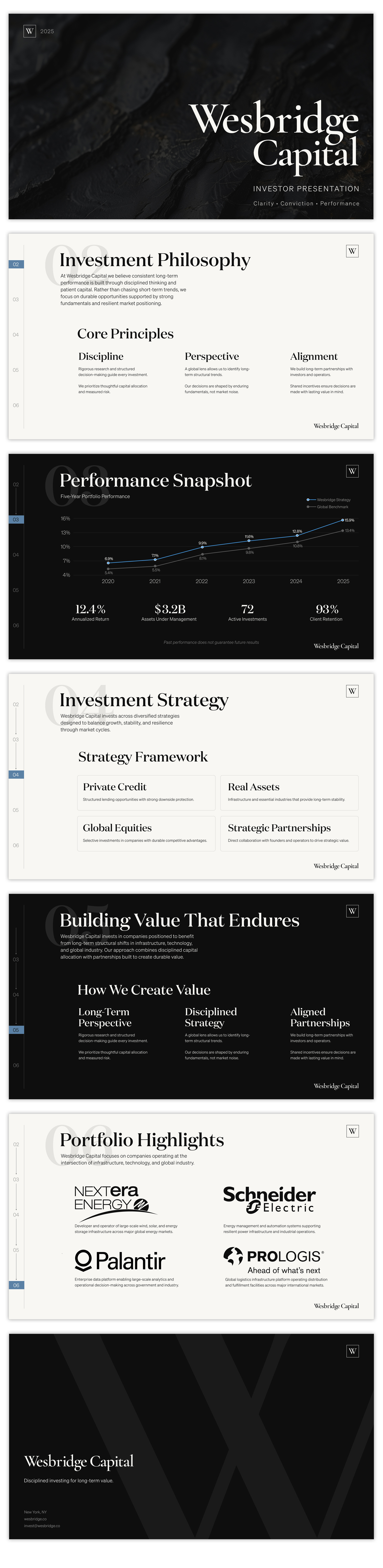
A presentation system designed to communicate the firm’s strategy, performance, and long-term investment philosophy with clarity and consistency. Created as part of the broader brand and digital identity.
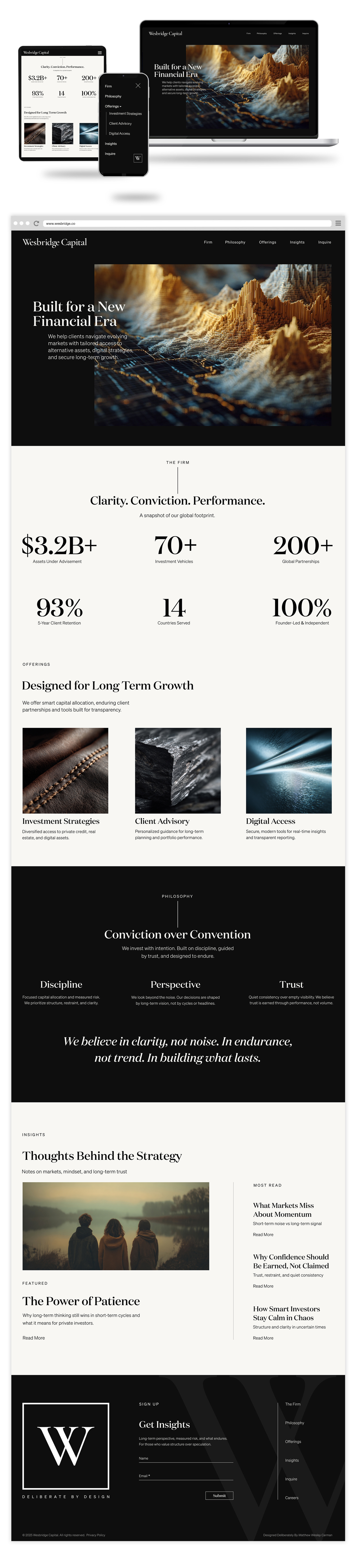
A digital extension of the Wesbridge Capital brand, translating the firm’s investment philosophy and positioning into a clear, modern web experience. Developed as part of the broader identity system.